Status pages
Public pages for keeping users informed about the state of your services.
Overview
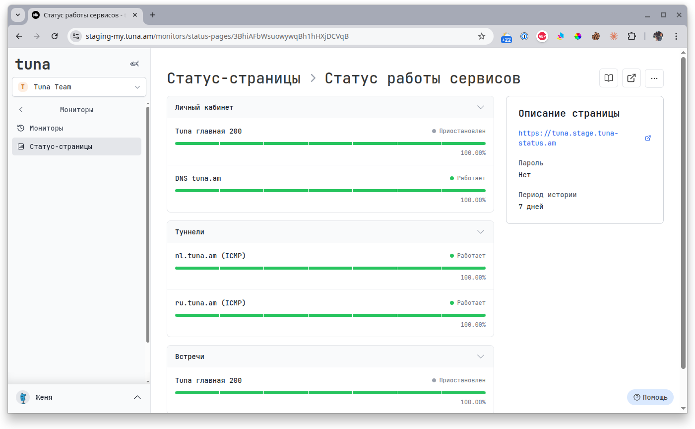
A status page brings selected monitors together into a single public page with availability history and the current status of each service. It is convenient for showing customers and your team what is working, what is temporarily unavailable and what the uptime of your infrastructure is.
- Inform customers about service availability
- Show availability (uptime) history with a clear scale
- Group monitors by logic (Dashboard, API, Databases, etc.)
- Protect the page with a password for internal use
- Brand the page for your project — logo, favicon, links
- Host it on your own subdomain
*.tuna-status.am
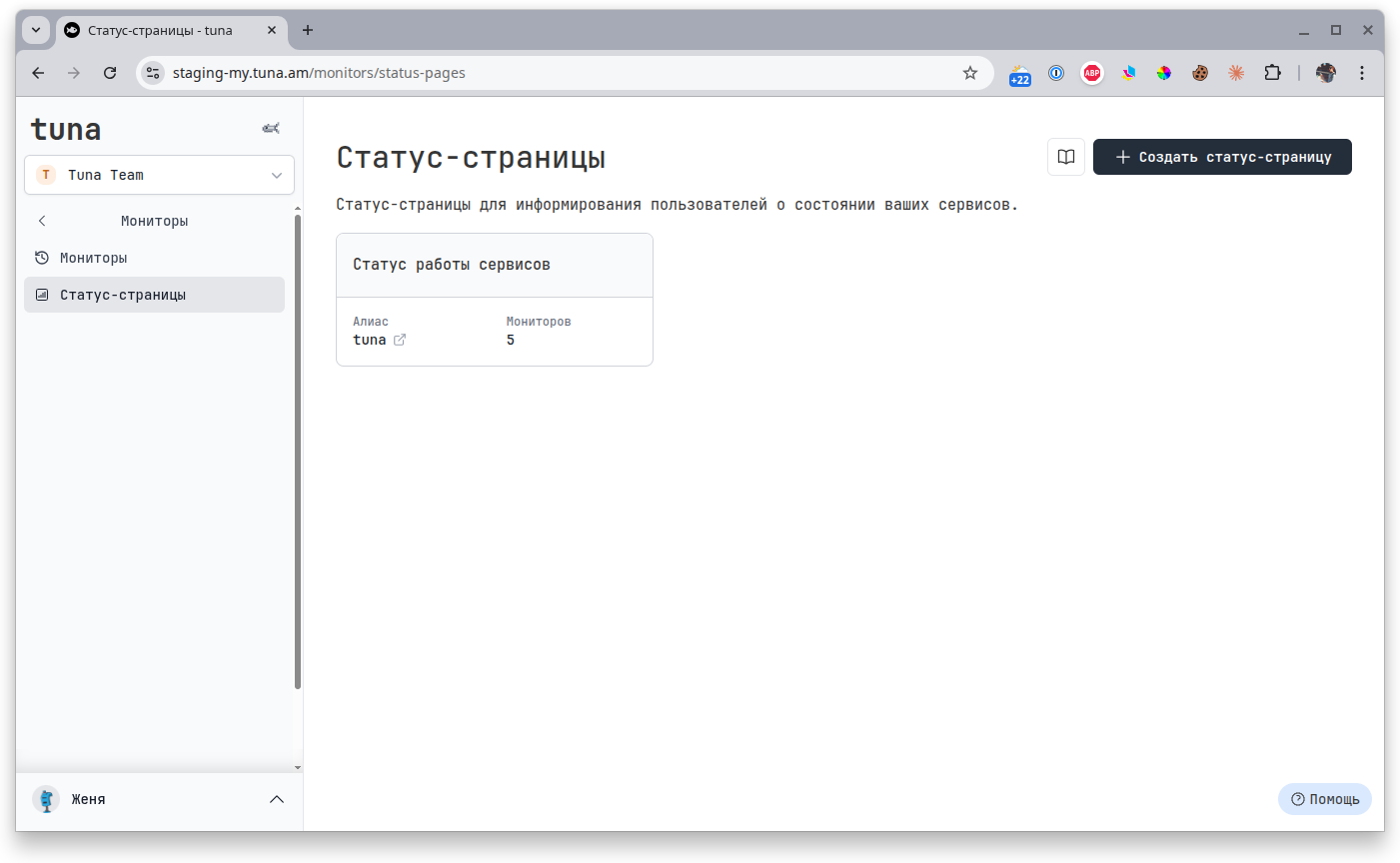
List of status pages
All your pages are available in the Status pages section. Here you can see the name, alias (subdomain) and the number of attached monitors.
Creating a status page
- Go to the Status pages section.
- Click + Create status page.
- Fill in the basic settings and select monitors — see details below.
- Save the page — it will be immediately available at
<alias>.tuna-status.am.
Settings
Basic
- Name — shown in the page header and the browser tab title.
- Alias — defines the page address in the format
<alias>.tuna-status.am. - Description — short text under the title (optional).
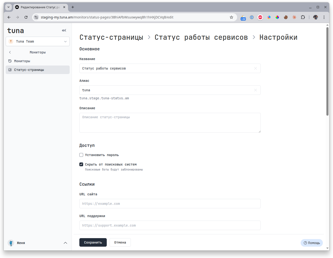
Access
- Set password — protects the page with authorization. Useful for internal dashboards or private clients.
- Hide from search engines — adds a block for search bots so the page is not indexed.
Links
- Website URL — link to the main website of the service. Shown on the status page.
- Support URL — link to the support form or portal where users can reach out during an incident.
Branding
Tailor the look of the page to your corporate style:
- Logo — image in the header (PNG, JPG or SVG).
- Logo link — where the user goes when clicking the logo (usually the site home page).
- Favicon — browser tab icon (PNG, ICO or SVG).
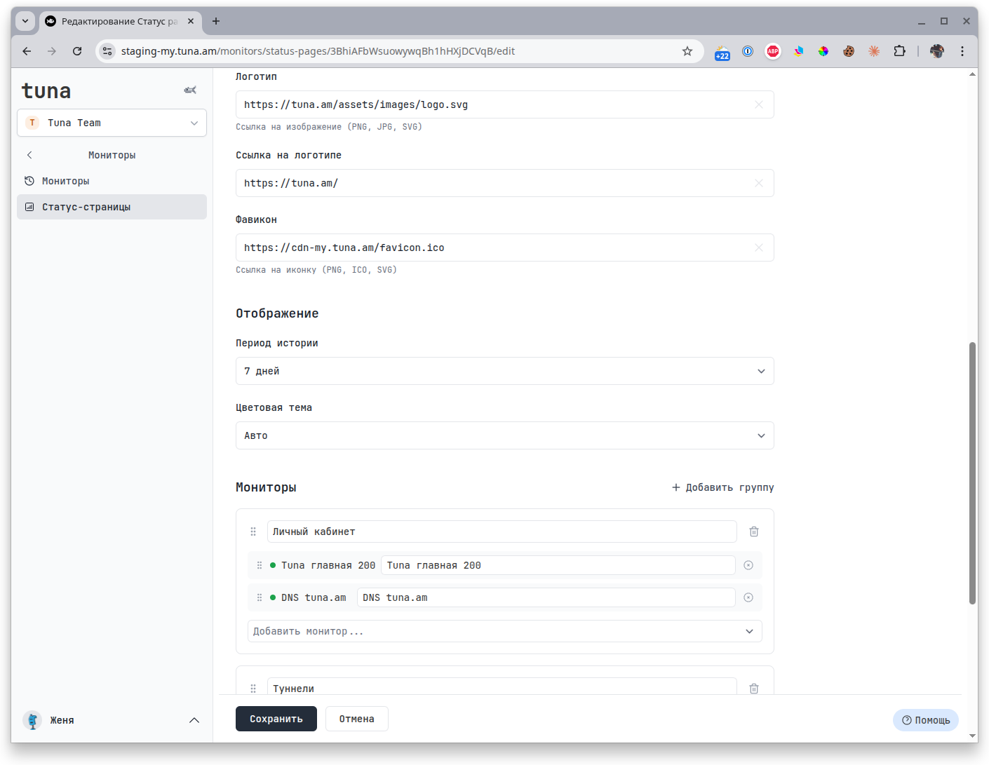
Display
- History period — for what period to show availability history (for example, 7 days).
- Color theme —
Auto(follows the user's system), light or dark.
Monitors
Add monitors and group them into sections — each group gets its own heading on the page. Inside a group, monitors can be renamed (what the user sees may differ from the internal name in Tuna).
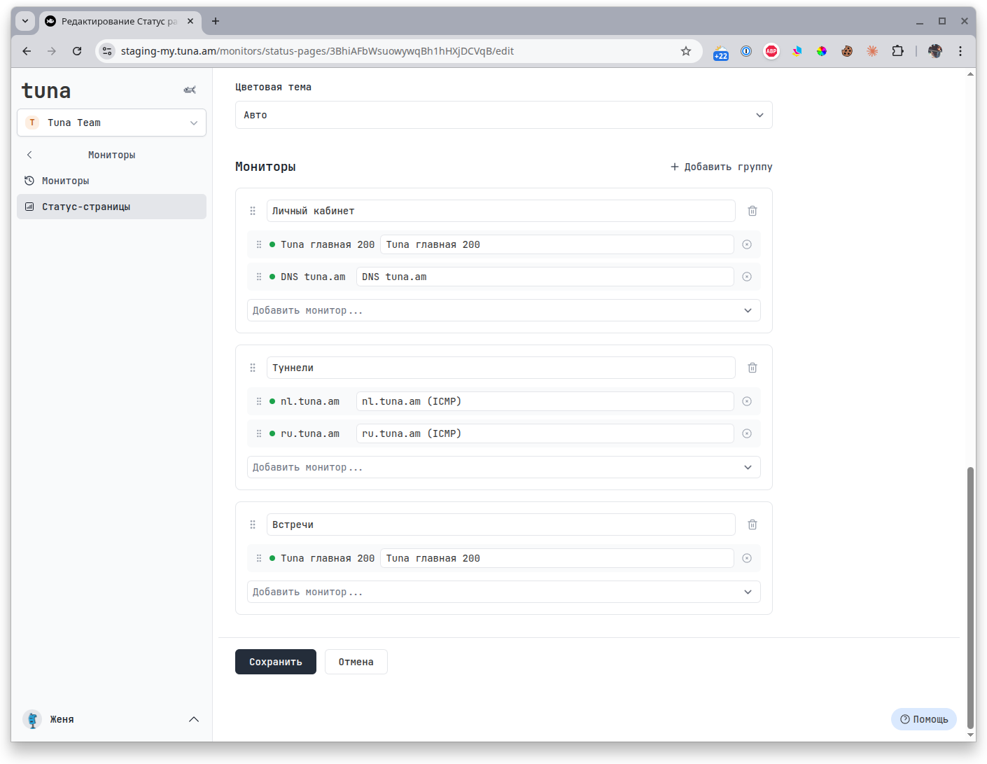
Groups and monitors inside them can be dragged — the order on the status page matches the order in the settings.
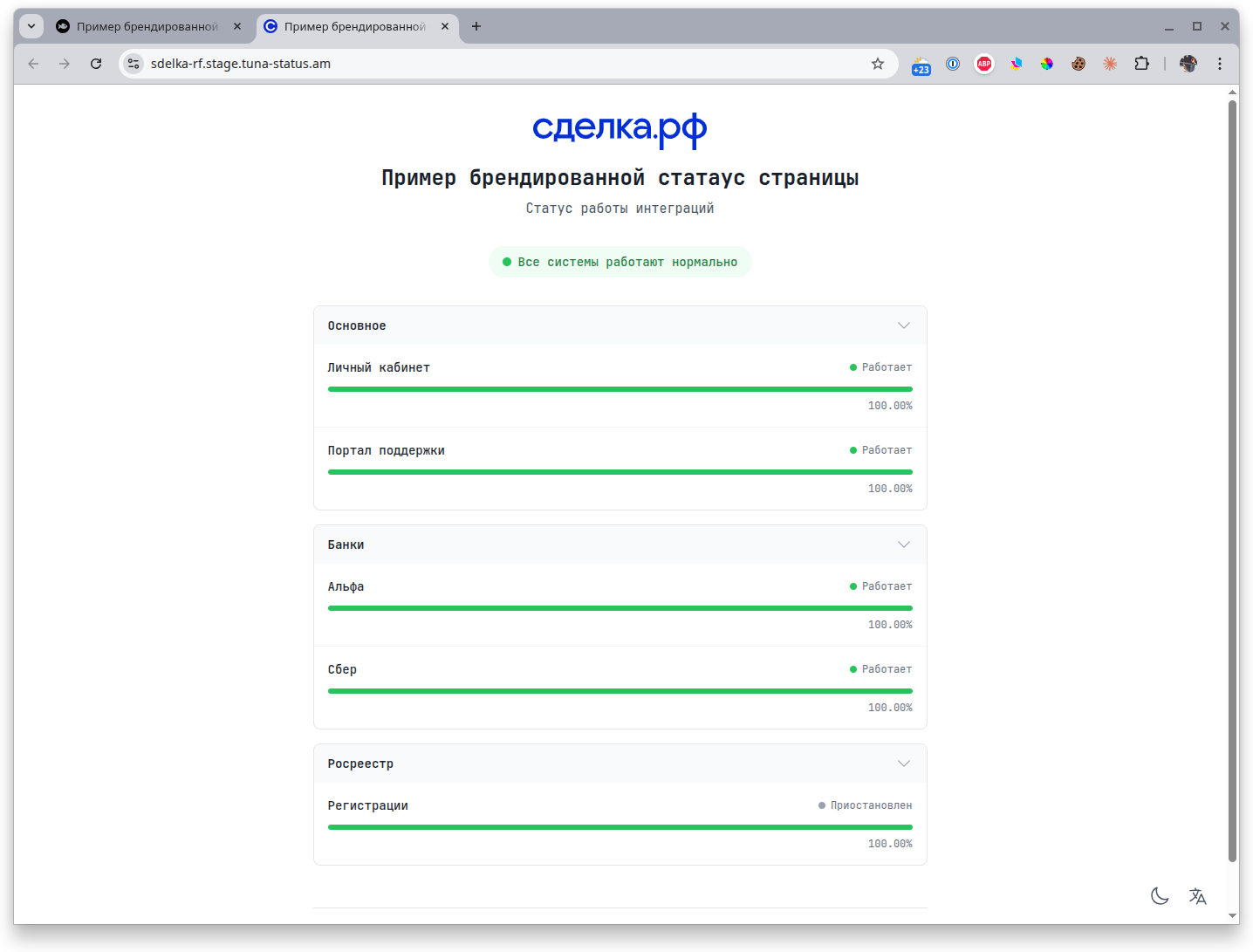
How the page looks
Here you can see an example of a branded status page in light and dark themes.
Light theme
Dark theme
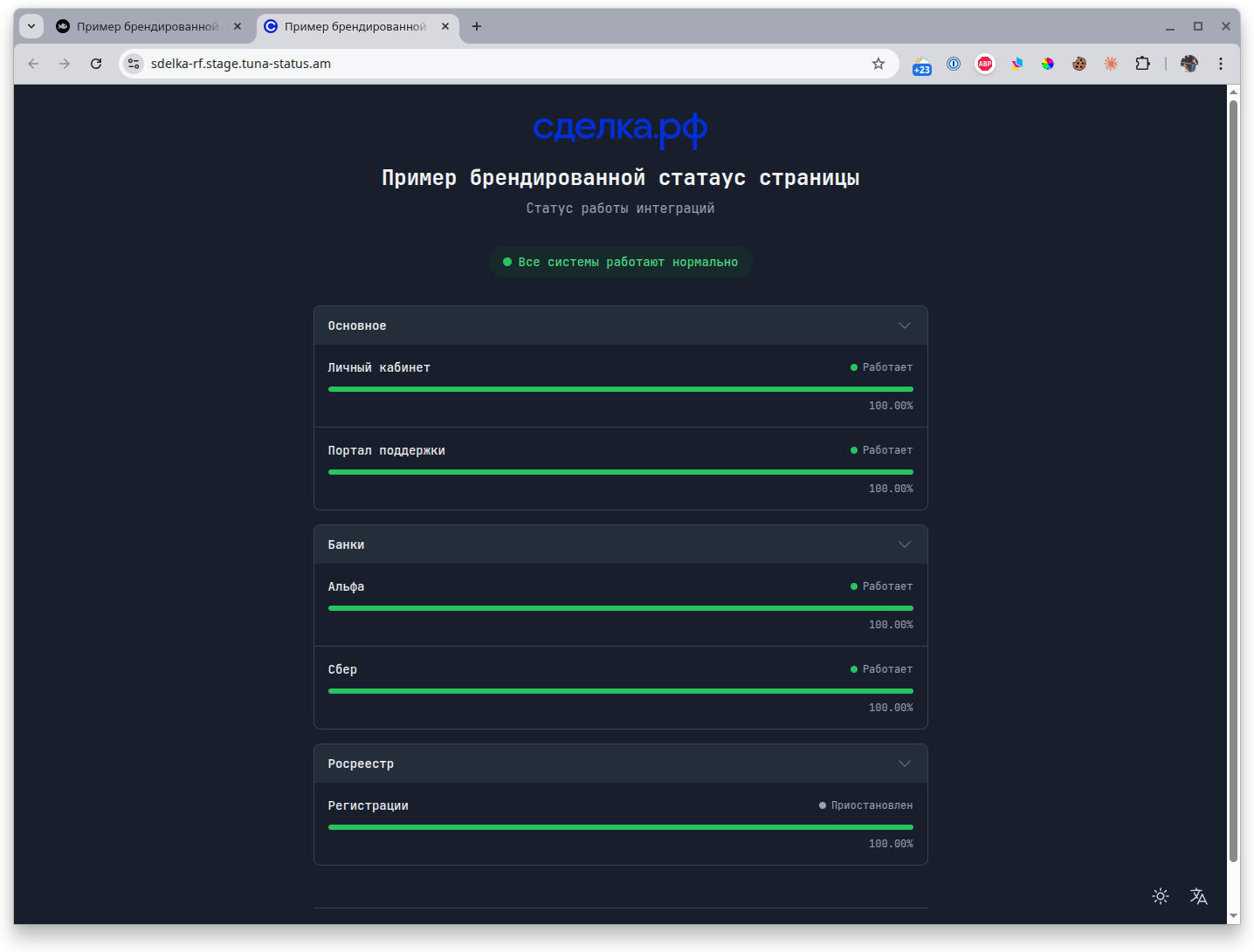
In the lower right corner the user can manually switch the theme and the interface language.